The beginning of a new chapter
In 5 years, Gearbest has become one of the world's leading online stores, having acquired 40 million satisfied customers, and maintains its mission: to give the world goodness, convenience and quality life.
Approaching its 6th anniversary, Gearbest is changing itself to remain the same beloved store of millions. And we decided to share with you a new brand book that will accompany us over the next 5 years.
IMPORTANT: Heraldry, the power of symbols and mottos, are very important for China. It is in them that thoughts and ideas are hidden. Therefore, rebranding Gearbest is not just a change in appearance, but a rethinking of activities.
Key ideas:
To create the new Gearbest, we needed to reflect all previous experience and a whole year of work.
Now Gearbest is even brighter, even more energetic!
But it is constant - like all the past years.
And it's updated, simple and accessible to everyone. As before
Development of new Gearbest:
Thanks to the efforts of 17 dedicated designers and over 40 exciting and original ideas, we have We have a new Gearbest logo - the classic black and yellow smiley icon, transformed from G.

Color selection:
The new Gearbest inherits the black and white color scheme of the old Gearbest. But at the same time, the logo now has a brighter, progressive, modern color that goes well with the current shape:
- White represents simplicity, brilliance and purity
- Black represents elegance, grace and strength
- Yellow represents high spirits, energy and freshness
The combination of these colors combines into a single heraldic meaning, actualizing Gearbest's mission: to provide the best online shopping experience, demonstrate the highest level of professionalism to customers and help fulfill all the desires of users that bring them to Gearbest - every time, again and again.
Logo
Smiley: The letter "G" recreates and reinvents the classic smile, reflecting Gearbest's commitment to being a place where all customers can feel inspired and want to shop.
Text: The new Gearbest logo uses a text font with minimal corners (compared to old) which reinforces the idea - Gearbest is trying every minute to get closer to the ideal, offering customers more with every day.

Keyword:
- Quality, Availability, Joy
Gearbest will do everything to achieve its mission of providing a shopping experience and user experience to improve the lives of every customer.

- Quality:
The premium quality of products must be confirmed both in purchase and in use by the client.

- Availability:
Shopping should be accessible to everyone, and prices should be extremely low.

Joy: shopping should be interesting, pleasant and attractive at all stages - from selection to receipt.
Brand Guide:
The new Gearbest logo contains two main elements: Sign and Font
Logo
Text: font and space between letters cannot be changed and cannot be used without an icon
The main logo is the main official logo of Gearbest and in most cases it should represent the online store. The new Gearbest logo can be used in combination with the following background colors:
Color design
Black can be used when the above option is incompatible.
Yellow may be used if the above option is incompatible. In such cases, the icon background is not used.
- Standard view:

- Black and white (monochrome):

- Inversion:

Implementation
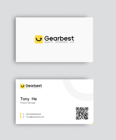
- Business card:

A clear visual representation of the new updated Gearbest logo on the business card is a must.
- Phone case:

- Shopping bag:

Final thanks!
Thanks to its dynamic and sustainable growth, Gearbest has become one of the most relevant global brands of the last 5 years. This is only possible because each of our incredible customers supports us. With this new corporate identity, Gearbest will retain its same ideals and values for all customers, new and old, for the next 5 years and beyond.
