Content
- 1 Typical mistakes
-
2 Myths about interiors in domino colors
- 2.1 Bad experience of the 90s
- 2.2 Black is not always a symbol of darkness
- 2.3 Spatial solutions
- 3 Conclusion
There is also harmony in contrasts. The most obvious contradiction in the world of color is, of course, black and white that are polar to each other.
However, the world has long found out that this contradiction is nothing more than a dialogue. And nothing is clearer and clearer. That is why the black and white kitchen interior will look modern and relevant at all times.
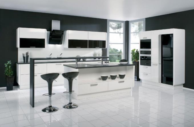
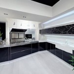
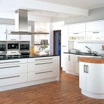
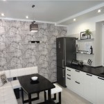
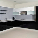
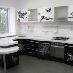
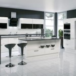
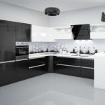
Classic modern minimalism - corner black and white kitchen
In the interior, laconic bi-color becomes a palette with an infinite number of possibilities. In other words, the black and white combination is in perfect harmony with almost any color.
Therefore, if suddenly, you want to change the strict design of the kitchen, then it will be enough to change the facades of the headset or revive the design with bright decorative elements. And thanks to the possibility of acquiring individual pieces of furniture (facades, fittings), you can easily change the design of the kitchen with your own hands.
Typical mistakes
- When creating an interior in dark colors, it is necessary to avoid flat solutions. In other words, if you choose a black finish, then the floor and walls should be kept in the same tone in order to exclude such an option when the dark floor emphasizes the outlines of the room;
- Surface texture plays an important role in such interiors. The alternation of gloss and matte finishes sometimes give a stunning effect. A black and white glossy kitchen set against a dark textured wallpaper is ideal as an example (see also article Glossy black and white kitchen: ideas for a harmonious design);
- Speaking about the use of black and white palette, you need to remember the basic rules of the influence of color on the visual perception of space. White - visually expands the room, brings the feeling of air and freedom. However, too much of it can lead to a feeling of emptiness;
- Black, on the contrary, narrows the space. But with the right lighting, it fills the room with special warmth. Another such moment, local areas in dark colors, are able to visually distance the element. This technique is widely used when decorating niches in order to emphasize their depth;
Myths about interiors in domino colors
Bad experience of the 90s
We usually avoid black interiors in our home, because we associate it with a dark and dark space or with the unfortunate style of the 90s. Then, lovers of extravagance, tried to use dark colors in existing interiors.
Naturally, the lack of correct color solutions and harmonious compositions led to the fact that the decoration of the rooms looked pretentious and gloomy.
Fresh trends in modern design have given us a new interpretation of styles such as:
- Art Deco;
- High tech;
- Minimalism;
- Neoclassicism.
They suggest a harmonious combination of contrasts.

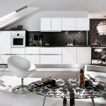
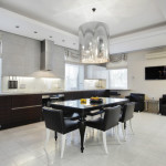
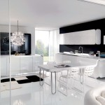
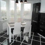
The interior of a black and white kitchen combined with a living room in the neoclassical style
After that, the popularity of black and white interiors began to grow, and modern designers have learned to masterfully use the full potential of color solutions in the "domino" style. And even in spite of the fact that the price for black-and-white corner kitchens is on average 20 - 30% higher than standard options, they invariably remain a hit of sales.
Black is not always a symbol of darkness
Indeed, the black interior is versatile and, like formal suits, is always relevant and elegant. And black is also associated with an abyss, against which you can create the most expressive and vivid compositions.
Which color to choose the dominant will depend on what effect you want to recreate, light weightlessness or strict academic. As a rule, it is dictated by the architectural features of the room and personal preferences.
Spatial solutions
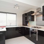
Considering that old layouts are limited space, glossy black and white kitchens can be advised. The reflective effect of mirrored work aprons, glossy facades will help create the illusion of space (see also article on black and white kitchens).
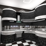
The wavy silhouette of the headset is repeated in the thin lines of the ornament on the walls (photo). This technique is widely used by designers to add lightness and volume to the design.

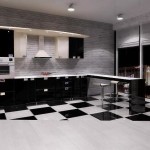
Glossy black and white kitchens - continued in reflection
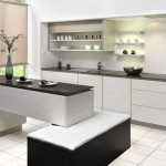
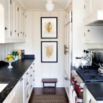
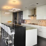
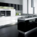
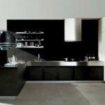
By the way, corner black and white kitchens are not the only design solution in rooms with a lack of free space. Using white facades, you can fully fit the linear arrangement of furniture. Only in this case, the countertop acts as an accent, usually it is made of artificial or natural stone of dark shades.
It would be nice to complement such an interior with an interesting black and white ornament (see also the article on black and white kitchens). Against a light background, it will look like an engraving or the delicate art of a calligrapher, this will add special charm and originality.
It is difficult to imagine that with the help of black and white one can depict the tenderness of spring. See how the professionals do it in the video at the end of the article.
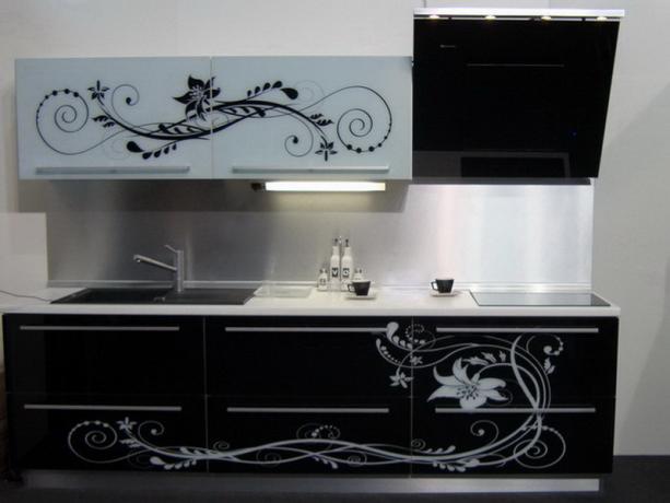
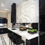
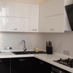
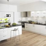
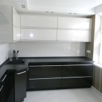
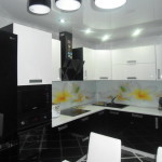
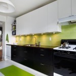
White top black bottom - the grace of aristocracy
Council. There is an opinion that black and white kitchens are not very practical and require special care. Practice has proven the opposite.
The housewives, who dared to choose a kitchen in domino colors, have long ago adapted to maintain cleanliness and order. Their instructions are simple: a soft microfiber cloth plus 5 minutes of time will rid the surface of dirt and help to shine.

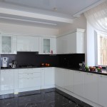
Corner black and white kitchen - fresh notes in strict interiors
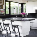
If you are closer to home comfort, then indoor plants or a bunch of flowers will help soften the contrast of black and white.
Conclusion
This version of kitchen sets has an infinite number of transformations. It can be changed even depending on your mood.
It is enough to add a few bright elements and there will be no trace of the laconicism of minimalism. The main thing is to maintain balance and proportions in everything.
Gallery


