Content
-
1 How to choose the right colors
- 1.1 The influence of color on the perception of space
- 1.2 Color circles and tables
- 1.3 Color intensity
-
2 How can you combine colors
- 2.1 Types of color combinations in the interior
- 2.2 What colors go well with each other
- 2.3 Two-tone furniture
- 3 Patterns and drawings
- 4 Conclusion
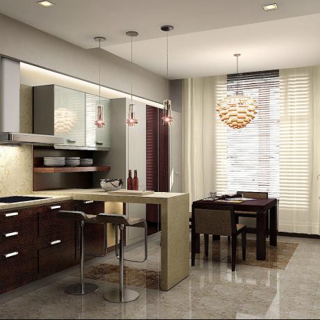
A high-quality kitchen design lies not only in the correct stylistic selection of its individual elements. It is very important that the combination of colors in the interior of the kitchen is harmonious and pleasing to the eye.
Your mood while cooking, the perception of the kitchen by those who are in it, and even their appetite depend on how much you succeed.

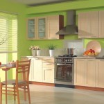
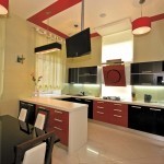
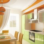
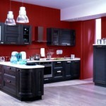
The combination of brown in the interior of the kitchen with white and rich red
How to choose the right colors
Each person has their own color preferences. This is due to the psychological influence of color on a person. And since we are all different, our tastes also differ.
If you already know what tone must be present in the kitchen design, you need to decide how to complement, dilute or shade it.
The influence of color on the perception of space
First of all, evaluate the size of the kitchen, its illumination, position in relation to the cardinal points.
So it will be easier for you to understand in what colors - warm or cold - it will be designed.
For reference. Warm colors include red, orange, yellow and all their shades. To cold - green and blue, from the palest to the brightest tones.
- If the kitchen windows face the north side, it is better to use materials of warm colors and shades for decoration.
If to the south - the advantage should be given to cold. They will bring a touch of freshness and coolness to the interior.

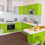
The predominance of orange makes the interior warm and sunny
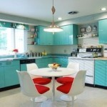
- Cold color combinations can visually expand the space, so they are used for design of small kitchens. Warm ones, on the contrary, visually bring objects closer, with their help, you can make spacious rooms more comfortable.
Color circles and tables
If you are not sure that you can cope with such a difficult task, relying only on your own taste, you the table of color combinations in the interior of the kitchen will help, according to which harmonious with each other is easily determined shades.

Part of the color chart
The previous photo shows only part of the table for four colors.
- The first column is the main color, which is guided by when selecting the entire palette. It can have walls or a kitchen set.
- The second column is the most suitable shade of the base color.
- The third column is also suitable for the main shade of another color, which can be used in small quantities.
- And the fourth column shows a contrasting main shade. This color can have accent details of the kitchen interior.
The basic colors of the table are white, gray, beige and black - they can be combined with any colors and shades of the color palette.
If you just need to "catch" the desired contrasting color in order to correctly place accents, the easiest way is to use the color wheel.

Itten's color wheel
Matching contrasting shades are positioned exactly opposite your chosen base color.
Note. This combination of colors in the kitchen looks very expressive, but it is better to use them in unequal proportions, otherwise you will quickly get tired of too bright a picture.
Itten's circle will also help define warm and cold shades. If you need a "cool" interior, use any shades of the left side of the circle as dominant, and vice versa.
Color intensity
One and the same color can have different intensity, look differently on different textures.
Designers give the following tips when it comes to combining kitchen colors:
- In a monochrome interior, when the color of the walls and furniture is the same, the kitchen set should be slightly darker than the walls.

The right color combination in the kitchen
- To make a kitchen with pastel-colored furniture not seem boring and faded, add bright accents to it in the form of curtains, upholstery of the kitchen sofa, tablecloths, etc. Walls can be bright and intense.
- If you have chosen a headset of a very active color that attracts the eye, then it should stand against the background of the walls in a calm color scheme.
- Saturation and depth of color enhance glossy surfaces, while matte surfaces tone them down.
How can you combine colors
If you are doing repairs with your own hands, choosing materials yourself, planning a design, then the combination of colors in the kitchen needs to be thought out in advance. A monochromatic interior looks dull and monotonous, and contrasting shades competing in equal proportions cause fatigue and irritation. How to find a middle ground?
Types of color combinations in the interior
As in nature, the combination of colors in the interior can be different.
There are three main types.
-
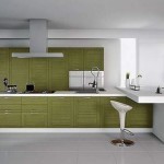
Monochromatic - when using different intensity shades of the same color. It is more suitable for a bedroom or living room as it creates a soothing atmosphere.
Although plain kitchens in a classic style look very dignified.

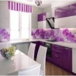
Monochrome combination of beige in the interior of the kitchen
-
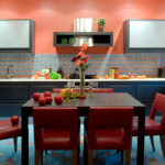
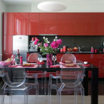
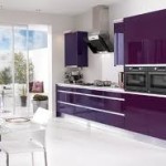
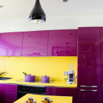
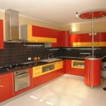
Contrasting - the design is based on opposite shades, making the interior bright, cheerful and elegant. This combination of colors for the kitchen speaks of the energy and optimism of its inhabitants.
It is used for decoration modern kitchens.

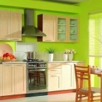
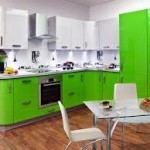
The combination of light green color in the interior of the kitchen with contrasting red details
Council. To make the interior of the kitchen harmonious, use a contrasting color only in details. These can be curtains, lampshades, sofa cushions, tableware in plain sight.
-
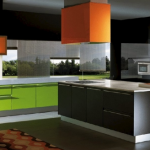
Mixed - is based on the use of one of the pure colors as the dominant one. The purest ones include red, yellow and blue, mixing of which in different proportions gives all the other shades of the color palette.
Any of them can be used to decorate details - both contrasting and monochromatic.

Try to use no more than five colors
In any case, you need to choose the dominant shade against which you will "paint your picture."
What colors go well with each other
It is difficult for an ordinary person, not privy to the secrets of color, to understand all its rules, circles and tables. He needs specific instructions - what exactly fits what, and what combinations are best not to use.
She is in front of you:
- The most versatile colors are black and white. They look great in any combination. Still, red, yellow, orange, green, and pink work best with black. And to white - red and blue. Of course, their classic combination with each other will be ideal.
- Brown goes well with green, beige, pink, cream, and bright blue.
- Gray - to bright blue, red, orange, purple, dark pink.
Note. Gray itself is not very interesting, but it can serve as a background for all other shades.

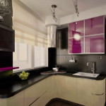
Gray and purple - a noble combination
- Beige is combined with white, brown and blue.
- Red - with white, yellow, blue, black and green.
- Yellow - with gray, blue, blue, purple, black.
- Green looks perfect with light beige, golden brown, yellow and black.
- Blue - with purple, yellow, red, orange, green.
- Purple, blue, blue, lilac are suitable for orange.
- To pink - white, gray, turquoise, olive and brown.
As you can see, for each color, you can pick up a lot of options using related shades or antipodes. It all depends on your perception and desire to give your kitchen a certain mood.
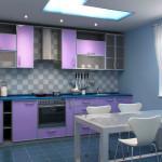
Two-tone furniture
Today, many people prefer to order headsets for the kitchen, in which the upper and lower cabinets differ in color. It is very important in this case that they are in harmony with each other, since kitchen furniture usually occupies almost the entire space of the room.
On the video clip offered to your attention, you can see different combinations, but it will not be superfluous to talk about the most popular of them.
- Orange - gray, black, blue;
- Blue - peach;
- Red - white, gray, black;
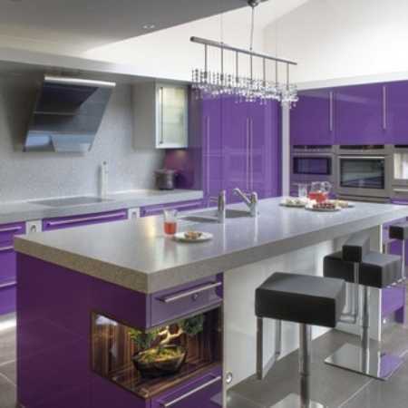
- Purple is yellow;
- Green - lilac, black;

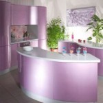
Lilac green kitchen
- Beige - dark brown;
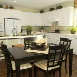
- Black and white. In general, any bright colors are combined with both white and black.
Patterns and drawings
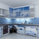
If kitchen furniture is usually monochromatic, then patterned wallpapers are often chosen for wall decoration, which also affect the perception of the interior. Therefore, it is not enough to know how to combine colors in the interior of the kitchen, you also need to take into account the colors of the walls, curtains, kitchen textiles, etc.
The following principles and rules apply here:
- A small drawing makes the room more spacious, and a large one makes you think that it is smaller than it actually is.
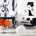
- Vertical stripes visually increase the height of the ceilings, and horizontal stripes decrease, but they make the kitchen wider.

Striped wallpaper helps to visually change the geometry of the room
- The diagonal pattern creates the illusion of movement, making the kitchen interior dynamic.
Conclusion
Finding the perfect color scheme for your kitchen is a difficult task. Not everyone can imagine how they will look together selected set, kitchen apron, wallpaper, ceilings and floor coverings. But the price of all these materials is high enough to experiment, changing what does not fit in color.
That is why the services of professional designers who are able to put together a whole puzzle from scattered pieces are so in demand today. If you can't afford their services, don't be discouraged. The designers themselves believe that there are no incongruous colors. The main thing is that you like your kitchen in the end.
Gallery